Building Layers: Acrylic Paint Opacity Guide
Unveiling the Canvas: A Guide to Acrylic Paint Opacity
Ever been curious about how some artists achieve breathtaking effects with acrylics? Let's immerse ourselves into the fascinating world of paint opacity!
Breaking Down the Basics of Paint Opacity
Envision opacity like a pair of sunglasses. Some are entirely dark, while others are transparent to a degree. The same concept applies to acrylic paints! Some colors provide total coverage, while others create fascinating translucent effects.
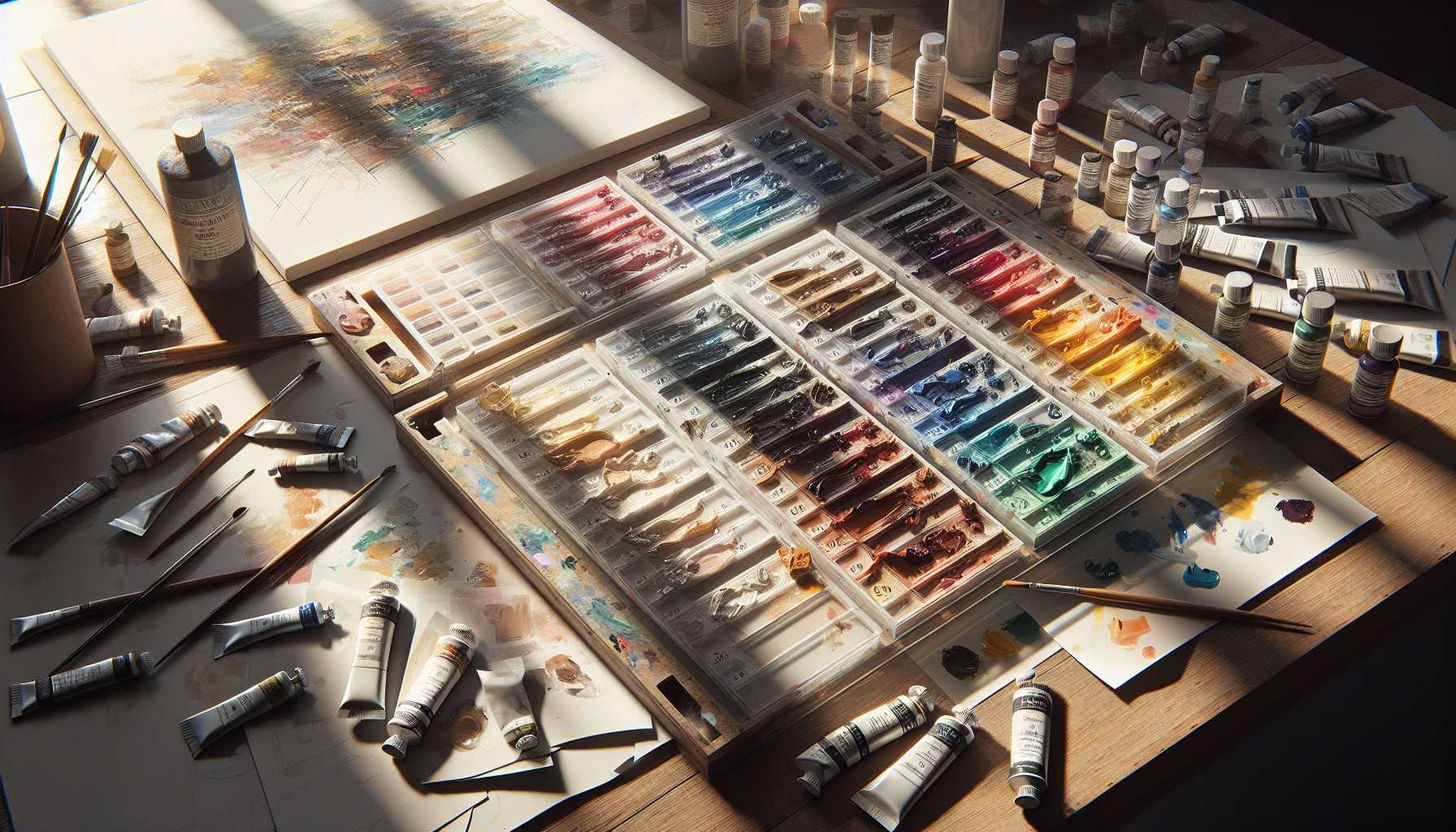
Acrylic Paints Opacity Variations
Transparent Hues
These paints are ideal for glazing and creating depth. Example colors include: - Quinacridone Magenta - Phthalo Blue - Indian Yellow
Semi-Transparent Hues
The perfect median! These paints have characteristics of both transparency and opacity: - Cadmium Red Light - Ultramarine Blue - Burnt Sienna
Opaque Hues
These are strong colors that thoroughly cover underlying layers: - Titanium White - Cadmium Yellow - Mars Black
Layering Techniques
Here's a nifty analogy: creating layers is akin to making a sandwich! Begin with your foundational layer and continuously build on top of it. Each layer contributes to the depth and intrigue of your painting.
Strategies for Managing Opacity
- Dilute paints with water to increase transparency
- Blend with medium for smoother application
- Overlay light colors on darker ones
- Experiment with opacity on scrap paper first
- Utilize white to enhance opacity
Common Challenges with Opacity
We've all encountered this! Sometimes paints refuse to behave as predicted. Here are some quick solutions: - Is it too transparent? Simply add another layer - Is it too opaque? Combine with medium or water - Inconsistent coverage? Employ several thin layers
Sophisticated Techniques
Want to take your skills up a notch? Try these engaging techniques: - Glazing using transparent colors - Dry brushing employing opaque paints - Crafting depth through opacity variations
Picking the Appropriate Paint
Read the label! The majority of brands utilize symbols to denote opacity levels. If uncertain, conduct a swift stripe test on both black and white paper.
Concluding Remarks
Always remember, there's no definitive "correct" method to handle opacity. The key is to experiment and find out what suits your style the best. Enjoy your painting journey!
Have you experimented with different opacity levels? What's your preferred technique? Share your thoughts in the comments below!
*Pro Tip: Maintain a small opacity chart of your paints for quick reference. It'll not only save you time but will also aid in planning your paintings more efficiently!