Understanding Paint Opacity: Transparent vs Opaque Colors
Getting to Grips with Paint Opacity: Navigating Transparent and Opaque Colors
Have you ever been curious about why certain paints are entirely all-covering while others seem to emit light? Let's embark on a captivating exploration of paint opacity!
Exploring Paint Opacity
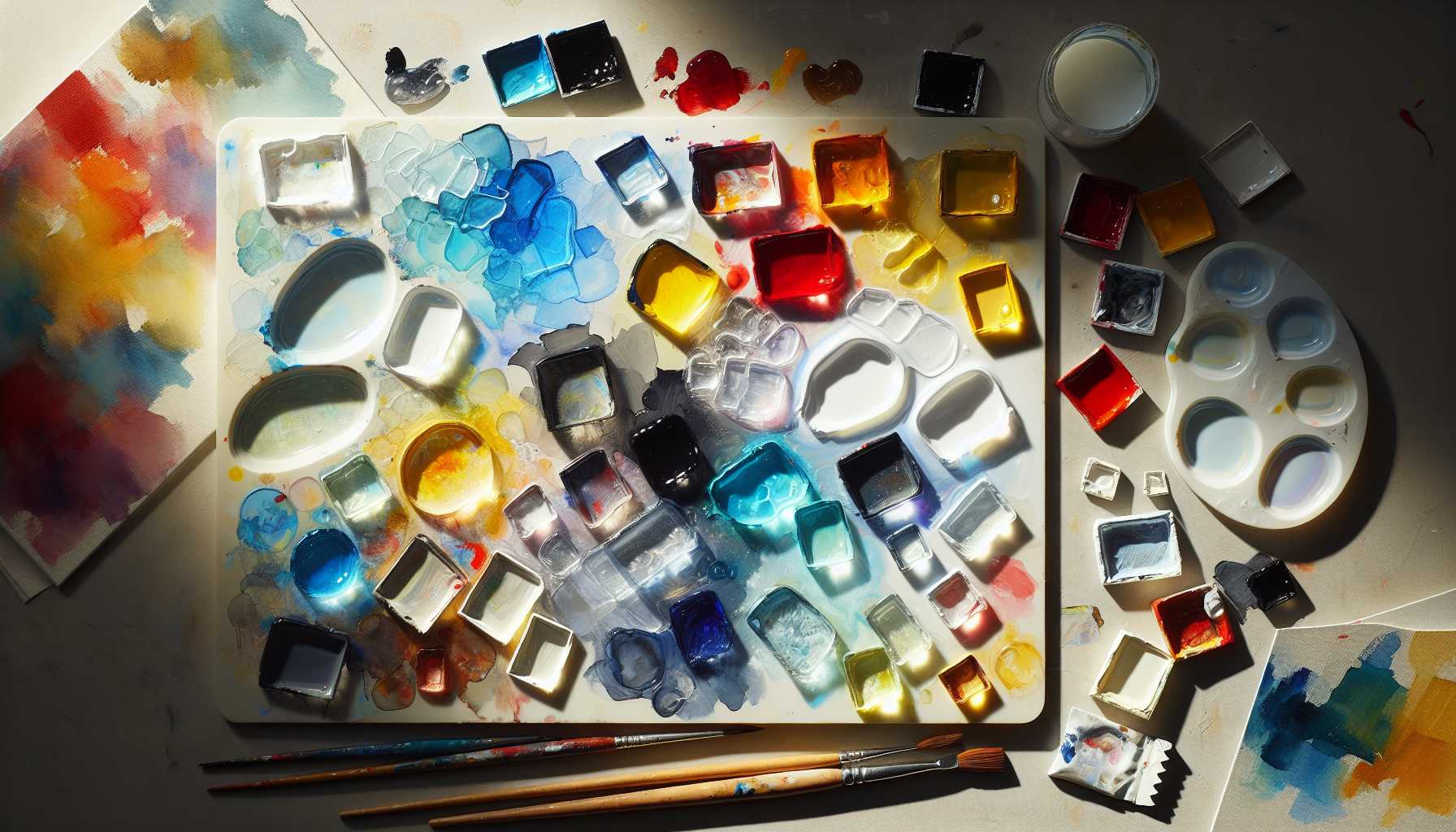
Paint opacity is essentially the extent to which light can penetrate through a layer of paint. To visualize it, envision sunglasses - some are dark and hinder most of the light while some are lighter and allow more rays to shine through.
Revealing the Beauty of Transparent Colors
Transparent colors are akin to colored glass. They: - Permit light to penetrate - Generate eye-catching layered visuals - Are excellent for glazing methodologies - Expose underlying layers - Encompass colors like Phthalo Blue and Quinacridone Red
Understanding Opaque Colors: Champions of Coverage
Opaque colors can be likened to an impenetrable wall. They: - Conceal completely - Cover underlying layers - Construct bold, dense spaces - Are ideal for forming base coats - Consist of colors like Titanium White and Cadmium Yellow
Identifying the Appropriate Time to Use Each Type
Transparent Colors Are Ideal For:
- Glazing methods
- Forming depth
- Achieving watercolor effects
- Delicate color mixing
- Layering gradually
Opaque Colors are Excellent For:
- Establishing base coats
- Crafting bold impressions
- Concealing errors
- Direct painting
- Forming stark contrasts
Strategies for Working with Both Types
Here's a fun fact: most artists utilize both! Some useful tips include: - Beginning with opaque colors as your base - Layering with transparent colors to add depth - Mixing them together for unique outcomes - Testing opacity on dark-colored paper - Conducting experiments and enjoying the process!
Common Pitfalls for Beginners
Don't fret, we've all experienced it! Keep an eye out for: - Relying on transparent colors when coverage is necessary - Anticipating all colors to behave uniformly - Overlooking to validate the opacity rating - Neglecting to test colors before application
Utilizing Opacity to Its Full Potential
Bear in mind, neither type outmatches the other – they are simply diverse tools in your artistic arsenal. The real enchantment occurs when you discern how to effectively harness both.
Practical Use Cases
Consider your project: - Seeking deep, luminous shadows? Opt for transparent - Need solid coverage? Go for opaque - Desiring to achieve layered effects? Use both - Crafting highlights? Opaque is your go-to
Concluding Thoughts
Mastering paint opacity is akin to acquiring a new artistic language. Once you have a handle on it, an entirely novel realm of prospective creativity unravels! The key is to experiment freely, take pleasure in the process, and remain unperturbed by inevitable mistakes.
There's one thing to always remember: every accomplished artist started as a novice. Pace yourself as you delve into these distinct characteristics, and in no time, you'll unearth your favorite ways of employing them in your artistic creations.