Fluid Art Color Theory: Perfect Paint Mixing Guide
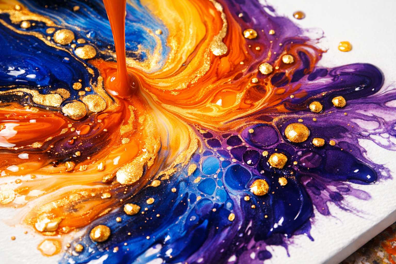
The Science of Colors in Fluid Art: The Ultimate Paint Mixing Guide
Have you ever found yourself wondering why certain fluid art pieces are mesmerizing while others fail to captivate? The key lies in the grasp of color theory.
Color theory isn't solely the domain of conventional artists, it's also a valuable tool in the dynamic world of fluid art. So, let's embark on this vibrant journey to craft stunning pour paintings that demand attention.
Deciphering the Color Wheel for Fluid Art
Your guide to a successful artwork is the color wheel. Consider it as an artistic compass.
Primary colors, the artistic building blocks, are red, blue, and yellow. They are unique in that they can't be created by mixing other colors.
When two primary colors meet, secondary colors - green, orange, and purple - are born.
Tertiary colors come into existence as the intermediate shades. Colors like red-orange, blue-green, and yellow-green add complexity to your color scheme.
Grasping this fundamental concept allows you to make wise color decisions, and this will certainly be appreciated by your fluid art.
Mastering Effective Color Harmony Techniques
Achieving harmony in fluid art is not as complex as it may seem, all it requires is patient practice.
Complementary colors are polar opposites on the color wheel, but when combined, like red and green, or blue and orange, they create dazzling contrasts and provide a visual flair to your work.
The color wheel neighbors, Analogous colors such as blue, blue-green and green, create beautiful smooth transitions resulting in a calming and natural look.
Triadic schemes, using three evenly spaced colors, such as red, yellow, and blue, yield vibrant and energetic work, making it an excellent technique for bold, striking art.
Split-complementary involves choosing one color and pairing it with the two colors adjacent to its complement. This technique, though less intense than traditional complementary colors, still offers a vibrant outcome.
Balancing Warm vs Cool Colors in Acrylic Pours
In the realm of fluid art, color temperature is significant. They too, evoke emotions.
Warm colors like reds, oranges, and yellows seem to advance or pop out in a painting, evoking feelings of energy, passion, and vitality.
On the other hand, cool colors such as blues, greens, and purples tend to recede or fade into the background, often giving off serene, peaceful, and intriguing vibes.
The fusion of warm and cool colors can create astounding depth. The viewer's eye usually settles on warm areas first. Utilize this natural tendency to guide the viewer's focus.
Experiment with using mainly cool colors with a splash of warm hue. The warm color will stand out significantly, serving as a compelling focal point.
Crucial Paint Mixing Proportions
Attaining the correct proportions can make or ruin your fluid art. If the consistency is too thick, the colors may not flow, if too thin, they may become muddy.
Begin with a 1:1 ration of paint to pouring medium. This usually works fine for most acrylic paints. Adjust according to the thickness of your paint.
Heavy body acrylics may require more medium. Experiment with ratios such as 1:2 or even 1:3. And for thinner craft paints, a 2:1 ratio might be more appropriate.
The ideal consistency would be that of warm honey; it should completely coat your stirrer without looking watery. Perfection here, as everywhere else, comes with practice.
Before applying to your masterpiece, always test your consistency on a practice surface. This can prevent disappointments and save your precious canvas.
Crafting Stunning Color Gradients
Gradients can bring a little magic into your fluid art, and creating these isn't as complex as one might presume.
Use colors that are adjacent to each other on the wheel to make dreamy gradients. Blue to purple to pink gradients look like a dream, while yellow to orange to red gradients bring to mind the warmth of a beautiful sunrise.
Arrange your colors by their density. Add a small amount of water to make certain colors lighter. Heavier colors will sink, while the lighter ones float creating a magical impact.
And remember, slow and steady does win the race. Quick movements can result in harsh, unwelcome lines, whereas gentle pouring can aid in creating smooth and transitional patterns.
Gently tilt your canvas after pouring. This will encourage your colors to blend spontaneously. Be careful not to overwork them.
Integrating Metallics and Special Effects
Who doesn't appreciate the allure of metallic in their fluid art pieces? Metallic colors beautifully catch the light and create stunning central points.
Gold looks stunning with deep blues and purples, while silver shines with cool colors. Copper, on the other hand, loves warm earthy tones.
Use metallic sparingly, as too much can overpower the piece. Small amounts create the perfect balance and impact.
Mix metallic colors with regular colors for a subtle shimmer. A combination of half metallic and half regular color creates impressive depth.
Special paint effects such as interference colors create a mesmerizing shift based on the angle of observation, adding an element of intrigue and surprise to your creations.
Solving Common Color Troubles
In the colorful world of fluid art, things can occasionally go awry.
Muddy colors are usually a sign of too many colors being mixed together. The key is to limit your palette to 2-3 main colors per piece and use accent colors sparingly.
If you find colors disappearing, it might be due to inconsistencies in density. Aim to balance your paint consistencies better and always test on smaller pieces first.
Sharp lines instead of smooth blends could mean your paint is too thick. In such situations, add more medium and give it another shot.
If you find your colors not moving enough, it might mean your paint is too thin due to excessive medium. Finding the optimum balance is a matter of constant testing.
Color Success: Pro Tips
Keep a color journal documenting your successful combinations, along with the ratios that worked well.
As much as possible, opt for good quality paints. Cheap paints tend to have weak pigments that can become muddy and dull quicker.
Pre-mix your colors before you start. Having everything ready beforehand prevents hasty color choices which more often than not, lead to unwanted results.
Always work in good lighting conditions. Colors appear different under varying lighting. Natural daylight usually reveals the most authentic colors.
Don't hesitate to take photographs of your work-in-progress. Sometimes, you might spot color issues better in a photograph.
Crafting Your Perfect Palette
Starting small with your color collection is smart. Six to eight colors can produce amazingly stunning art. There's no need to have every color under the sun in your possession.
First, invest in good primary colors. With red, blue, yellow, white, and black at your disposal, you can virtually create almost any color you wish to use.
Add one or two of your favorite accent colors, perhaps a brilliant purple or bright orange; these can become your signature colors.
Gradually build up your color assortment over time. It's best to familiarize yourself with the specific characteristics of each color before introducing new ones. Some colors can be overpowering and can dominate others in your palette.
Store your mixed colors properly in airtight containers to keep them fresh for future use.
Advancing Your Color Game
Experiment with color mixing on paper before graduating to canvas. This way, you learn without incurring significant costs.
Allocate time to study the works of other fluid artists. Try to identify color combinations that catch your eye and replicate them with your unique touch.
Explore different paint brands as each one behaves differently. Some brands may be more suited to your artistic style than others.
Join online fluid art communities to share your work and receive feedback. Other artists may notice things you didn't and provide you with valuable insights.
Above all, remember to enjoy the process. While color theory can guide your choices, your creative instincts drive the final artwork. Trust in your abilities and keep on pouring.
Everyone starts somewhere, and with each pour, your skills will only get better. Be patient, appreciate your journey and enjoy the budding relationship with the world of colors you're about to explore.
Here's to many more happy pours, and may your colors always flow harmoniously together.