Color Temperature: Essential Guide to Impressionist Painting
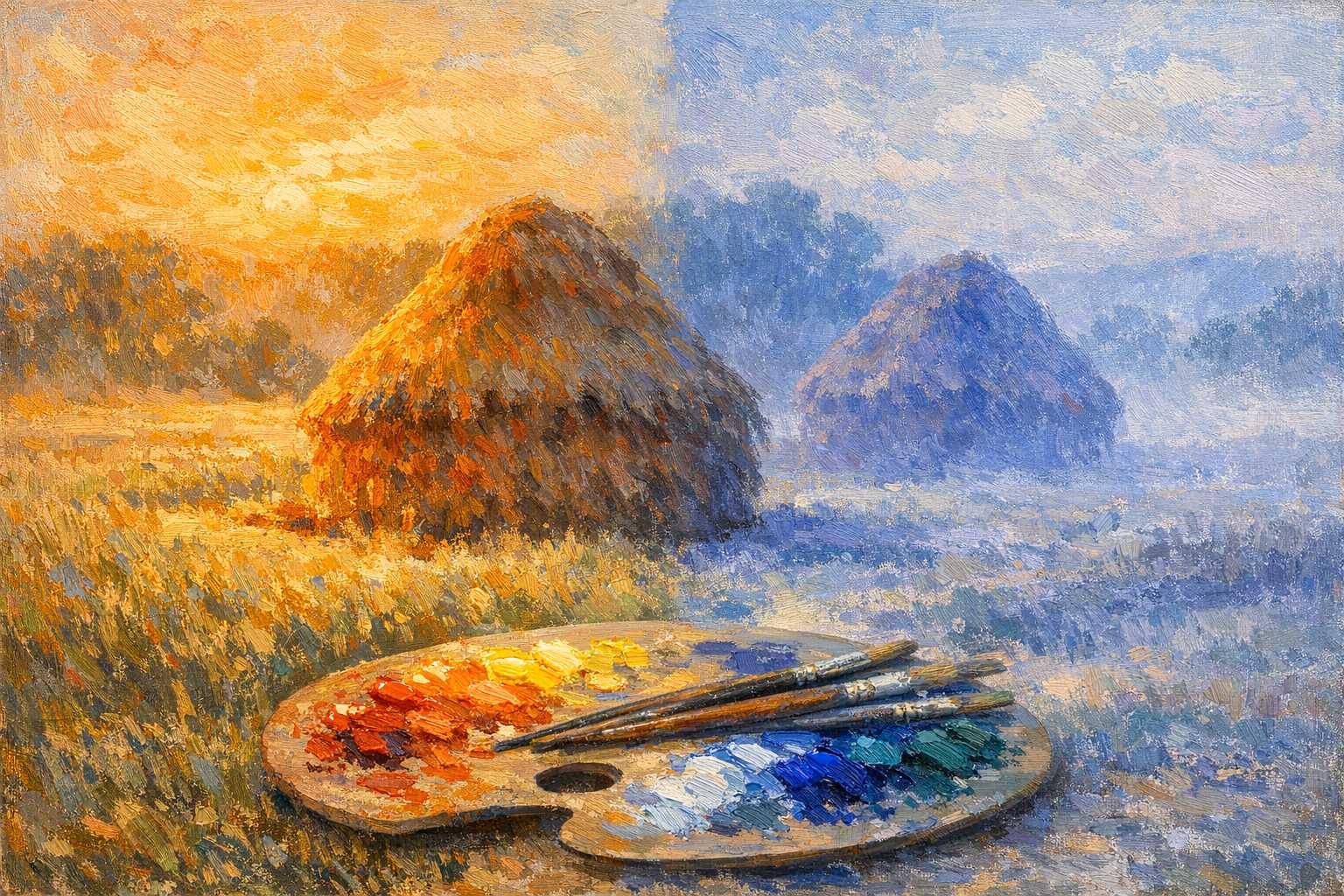
The Role of Color Temperature: A Critical Factor in Impressionist Art
Have you ever been intrigued by why some paintings convey a sense of warmth and welcome, while in contrast, others exude a feeling of cool detachment? The trick is in what we call color temperature. This concept is fundamental to the sphere of art and brought about a significant shift in the way painting greats like Monet and Renoir crafted their works of art.
Let's embark together on an exploration of this compelling subject. We'll unfold how comprehending the nuances of color temperature can prove to be a radical turning point in your artistic endeavors.
How Does Color Temperature Influence Art?
Color temperature refers to the warm or cold impression exuded by different colors. It's not about actual thermal heat but pertains more to the emotions or scene that a particular color sets in the viewer's mind.
To put it simply, imagine a comfortable evening sitting by a fireplace, versus a refreshing winter morning. The warm hues of reds and oranges emanate from the fireplace, whereas, the winter landscape sparkles with cool blues and whites.
Artists harness this natural association to stir specific emotions in the viewer's mind. Warm shades usually have a protruding effect on the viewer, while the cool colors tend to recede into the backdrop.
This basic principle effectively gives depth and atmosphere to a painting.
Warm and Cool Colors Explained
Warm Colors
The warm color spectrum comprises: - Red - Orange - Yellow - Red-violet - Yellow-green (predominantly yellow)
These colors embody elements of fire, sunlight, and autumn foliage. They evoke feelings of vivacity, contentment, and exhilaration.
In scenic paintings, warm colors often signify: - Places illuminated by sunlight - Foreground features - Specific times of day, such as sunrise or sunset
Cool Colors
The cool color spectrum includes: - Blue - Green - Purple - Blue-violet - Blue-green
These colors stir images of the aquatic world, the sky, and shadows. They hint towards stillness, remoteness, and tranquility.
Cool colors predominantly represent: - Areas covered in shadow - Background components - Water bodies and sky - Early dawn or twilight
The Impressionist Transformation of Color Temperature
Impressionism heralded a significant metamorphosis in the field of art. Before the influence of Impressionism, artists relied on mixing colors with black to depict shadows, often resulting in dull, lifeless paintings.
Impressionists made a startling observation; shadows are not just mere darker shades of their corresponding colors but have a distinctively cooler temperature.
An Epoch-Making Discovery
Claude Monet, a pioneer in the Impressionist movement, spent countless hours engrossed in studying haystacks and water lilies. He discerned that shadows contained tinges of blues and purples, not just grays and blacks.
This simple yet profound realization paved the way for a revolution in color theory. Rather than resorting to adding black to colors, Impressionists switched to using complementary colors and temperature differentiations.
Their change of approach had a dramatic impact. Their works emanated an unmatched vibrancy and radiance.
Useful Techniques for Employing Color Temperature
The Rule of Shadows
Here's a useful tip: Ensure that the shadows you paint are cooler in temperature than the highlighted sections.
If the sunlit grass has a warm yellow-green tone, the shadows should be represented with a cooler blue-green shade. This creates a look of natural depth and dimension.
Graduation of Temperature
Smooth transitions can be accomplished by gradually shifting color temperature. Start with warm shades in the foreground, slowly integrating cooler hues as you progress towards the background.
This method inherently echoes atmospheric perspectives.
The Complementarity of Warm and Cool Colors
Warm and cool colors pair wonderfully with each other. The fusion of orange and blue results in striking combinations. The same applies to pairs such as yellow and purple, red and green.
Use these color combinations to create lively, harmonious works of art.
Building Atmospheric Depth with Temperature Shifts
Morning Light
Early morning light typically emits a cool, blue tone. Even the warm morning sunlight appears cooler in contrast to the midday sun.
Depict morning scenes with: - Cool shades of blues and purples for shadows - Lights that are slightly warm yet understated - Subtle transitions in temperature
Midday Sun
The midday sun provides the warmest light of the day. Shadows, in contrast, become distinctly cooler.
For midday scenes, resort to: - Striking warm shades in sunlit regions - Sharp cool shadows - High contrasts between warm and cool shades
Golden Hour
Late afternoon and sunset scenes offer the most spectacular contrasts in temperature. The light radiates an intense golden warmth, while the shadows appear cool.
Add the magic of golden hour to your paintings with: - Rich shades of oranges and yellows for lighting - Deep hues of purples and blues for shadows - Maximum gradient in temperature
Common Pitfalls to Steer Clear Of
Relying Solely on Warm or Cool Colors
Never limit your painting to just warm or cool shades. This will result in a bland, monotonous effect.
Both temperatures are needed in every painting to create a balanced and interesting visual.
Overlooking Local Color
While temperature is crucial, don't disregard the authentic colors of objects. For instance, a red apple remains red, be it in warm light or cool shadow.
Rather than entirely replacing the local colors, adjust their temperature instead.
Overmixing Colors on the Palette
Impressionist artists often applied pure colors directly onto the canvas to maintain their vibrancy.
Overmixing leads to dull, lifeless shades. Ensure that your color blends are clean and intentional.
Exercises Dedicated to Mastering Color Temperature
Exercise 1: Temperature Studies
Create versions of the same basic subject at different times of the day, observing how the temperature dynamics change.
Consider painting an apple or an orange in varied light sources, such as: - Morning light - Midday sun - Afternoon warm glow - Evening shadows
Exercise 2: Complementary Shadows
Learn to paint objects using complementary colors for shadows. Consider painting an orange with blue shadows or a yellow lemon with purple shadows.
This exercise will help you perceive temperature relationships.
Exercise 3: Landscape Temperature Maps
Before creating a landscape, sketch a basic temperature guide. Mark warm regions with red dots and cool ones with blue dots.
This preparatory step will help you sustain consistent temperature relationships.
Tools and Resources for Controlling Temperature
Essential Colors for Temperature Dynamics
Construct your color palette around temperature pairs:
Warm colors: - Cadmium Red Light - Cadmium Orange - Cadmium Yellow Light - Yellow Ochre
Cool colors: - Ultramarine Blue - Cerulean Blue - Viridian Green - Alizarin Crimson (cool red)
Tips for Mixing Colors
Designate separate areas on your color palette for warm and cool mixes to prevent unintentional neutralization.
Use a palette knife to blend large color sections. Brushes may overmix delicate color pairings.
Lessons Learned from The Masters
Claude Monet's Works
Monet's series paintings offer exceptional learning examples in color temperature dynamics. His hay-stack and cathedral collections showcase similar subjects under varying lighting conditions.
Observe how he adjusts temperature according to various times of the day and different weather situations.
Pierre-Auguste Renoir's Paintings
Renoir specialized in creating warm, affable color schemes. Study how he used cool accents to counterbalance his predominantly warm palettes.
His figures radiate warmth while maintaining authentic color relationships.
Camille Pissarro's Creations
Pissarro excelled in executing subtle temperature transitions. His landscapes illustrate how mild temperature variations can introduce atmospheric depth.
Look for his sophisticated handling of morning and evening light.
Pushing the Limits of Your Color Temperature Skills
Outdoor Practicing
Nothing matches the learning gleaned from practicing in the natural environment. Painting outdoors forces you to experience real-life temperature dynamics firsthand.
Begin with easy subjects. Even a single tree or a building can teach you more about color temperature than complex scenes.
Maintain a Color Temperature Journal
Jot down your observations about light and temperature. Note how different colors transform throughout the day.
Maintaining this practice is instrumental in enhancing your perception of color.
Participate in Plein Air Groups
Painting with fellow artists can boost your learning process. Sharing perspectives and comparing interpretations of the same landscapes can offer new insights.
Conclusion
To sum up, color temperature is not merely a technical concept; it is the secret to creating paintings that genuinely encapsulate the essence of light and atmosphere. Inspiring artists for centuries, this concept was intrinsically understood by the masters of Impressionism and led to the transformation in traditional painting techniques.
The best way to begin is to start simple. Observe the warm and cool dynamic in everyday scenes and practice the basics before venturing into complex paintings.
Remember, mastering color temperature demands time and patience. Every brushstroke imparts a new lesson on how colors interact and influence one another.
Always bear in mind that your artistic journey is unique. Use these guidelines as your canvas, but don't shy away from experimenting and developing your personal style.
The Impressionist greats all started exactly where you are now - fueled by curiosity, observation, and a desire to encapsulate the stunning complexity of natural light. With consistent practice and determination, you'll cultivate the same intuitive understanding that made their artwork enduring.
So, take your brush and dive into exploring the fascinating world of color temperature. Your paintings will undeniably evolve, achieving an unmatched expressiveness and depth.